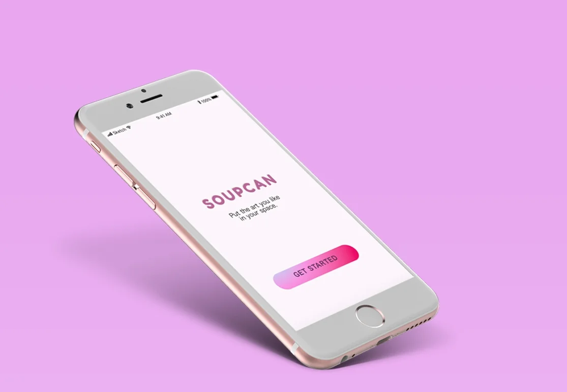
SOUPCAN
The idea is simple: To create a product that reimagines how we interact with art online, using Augmented Reality, Machine Learning and Gestural UI.
The idea is simple: To create a product that reimagines how we interact with art online, using Augmented Reality, Machine Learning and Gestural UI.
I started my project by testing how people currently interact with e-commerce art platforms. During key moments in the User Journey, I asked questions and documented user responses. It didn't take long before I realized a common problem: People looking for art online, have no idea what they want. Yet, the average art platform is built on the assumption that they do.
For instance, during onboarding on a few sites, users are required to enter multiple parameters about the type of art they like. From my research, I found that users were so frustrated by this process, that they dropped off onboarding altogether.
Naturally, I wanted to explore solutions that empathized with the user needs both visually and emotionally, by focusing the following:
IMPROVING BROWSING EXPERIENCE
Most art sites follow the same design formula: It's usually 2-3 columns cluttered with pretty pictures, prices and dimensions. In my opinion, they are uninspiring, rigid, generic and uninviting. It does little to mimic the gallery experience, leaving the user overwhelmed, confused or bored. I wanted a design that presented an exciting welcome - encouraging users to explore in a leisurely and playful way.
DISCOVER NEW ARTISTS AND GENRES
According to Forbes, more than 50% of millennials(18-35) discover artists through social media (Instagram & Pinterest). This shows that current art platforms like Artnet, Artspace, Saatchi etc. have all fallen short of providing a unique experience to improve user engagement. Making a product that is easily adoptable by the user will allow the user to navigate through artists/ genres easily and quickly.
AUGMENTED REALITY(AR)
Social media platforms are using the latest technology to improve user experience in a way art platforms are not. For instance, Snapchat is teaming up with Jeff Koons to create the first ever, global art installation in Augmented Reality. How cool is that? I envisioned AR to work as a core function of the app by providing a unique experience, and also to solve visualization issues with measurements, décor and spacing issues.
1. Allow users to see art in their own space, like it's already there (using AR).
2. Use a gesture-based interface that make interactions, repetitive, fun and addictive.
3. Use a clean interface that is decluttered and inviting.
4. Create a product that learns about the user needs, based on their behavior
User research and validation, persona creation, interaction design, user flows, wireframing, branding, visual design and prototyping
REALITY CHECK WITH A R
I ran into a few setbacks during my user research when some of my earlier assumptions turned out to be untrue.
1. Most people bought art because they loved it and it didn't matter if it fit with their decor or not. With that in mind, I decided to NOT make Augmented Reality the MVP (Minimum Viable Product) and focus more on improving the browsing experience.
I kept the AR feature because it kept users engaged and excited, but the functional element was marginal.
2. I also noticed from user interviews, people preferred buying directly from artists and they disliked buying from galleries. One user said "I like to support the artist's effort, galleries are too 'bougy'".
This made me change the process from designing to buy from galleries to buying directly from artists.
"NOT ANOTHER ART SITE!"
According to National Art Index, 22% of art sales occur online ($3.27 Billion in 2016), outperforming both museums and galleries. Surprisingly, millennials are leading the movement of investing in art online according to US Trust. They're connecting with artists directly using Instagram and other social media and skipping the galleries and museum altogether.
It became essential for my solution allow users to organically discover new artists.
After multiple interviews and surveys, I defined my target market.
Soupcan will appeal to the young/ trendy/ tech-savvy users. They like using Snapchat, Tinder, Instagram. Etc.
Gender: Male and Female
Age: 18 – 35+
Profession: Young professionals, College, University Students with a disposable income.
Personality: Expressive, Fun, Impulsive, Youthful, Cultured, Creative
SWIPES
Swipes are fun. They're easy, accessible and almost anyone can do it. Swipes will also track user behaviour, thus providing data mining opportunities. That type of information may be valuable to museums, galleries, collectors or any business interested in the arts.
MACHINE LEARNING
For every swipe, the user trains the app to learn what they like and dislike. The results from this will be more valid because it's based on user behaviour, not input.
AUGMENTED REALITY
iOS AR Kit is amazing. Not to get into the gritty details but the AR kit understands Real World Space i.e. how far or near you're from an object. It understands orientation and positioning. Incorporating AR let's us achieve 2 things.
1. Increasing engagement with a piece of art. According to Artsy website, the average time spent an art piece online is 1 -2 seconds. With AR, we can increase that time dramatically. This may give us more insight to user behaviour that simply didn't exist before. .
2. Allow users to interact with art in a brand new way.
GESTURAL UI
Using Gestural UI like swiping, scrolling, and tapping to operate an interface is important from a metaphorical standpoint. Making the interface invisible, allows for more micro interactions that can feel more natural to the user.

LowFi Ver1
LOW FIDELITY Ver1
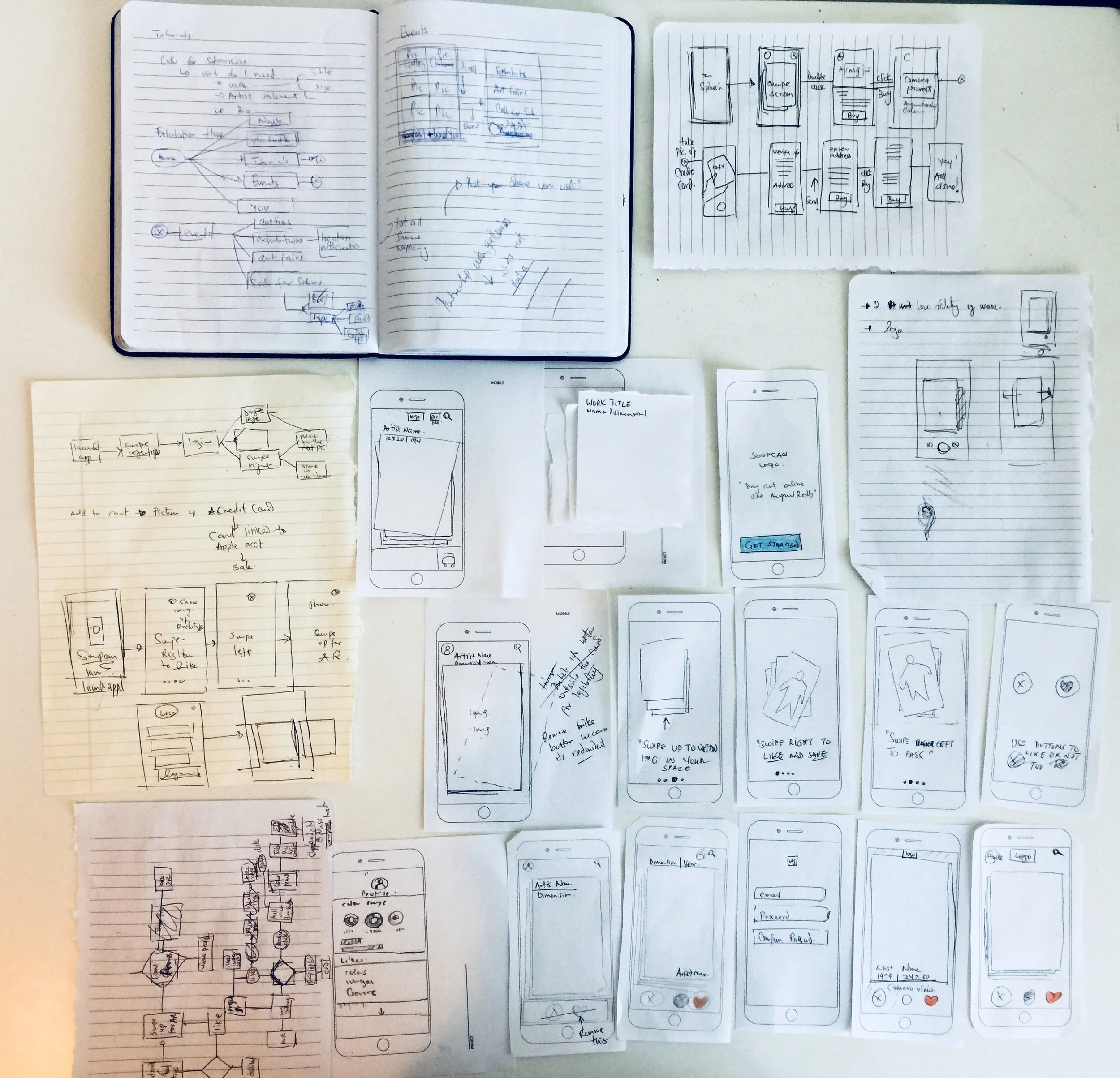
My wireframes focused on redesigning the online gallery experience and staying away from conventional design. I used Tinder and any augmented reality app I could find to polish up my UI Elements.
I learnt users felt my on-boarding process was redundant, and they were comfortable using the app without a tutorial.

LowFi Ver2
USER TESTING/ PAPER PROTOTYPES
It was crucial that the product be intuitive and easy to learn. However, creating a usability test for a gesture-based interface was challenging. To get around this, I used paper prototypes and mapped out multiple scenarios for my A/B Testing. My initial solution included "Heart" and "X" for "Like" and "Dislike" actions crucial to how the app would work. Most users felt it wasn't necessary, and they would rather swipe than click through the images.
At the LowFi ver2 stage, I tested for the following:
1. How many users understood the on-boarding without a traditional tutorial.
2. Did users prefer clicking versus swiping? Can I get rid of the “X” and “Like” button all together?.
User Testing/ Paper Prototypes
USER FLOWS
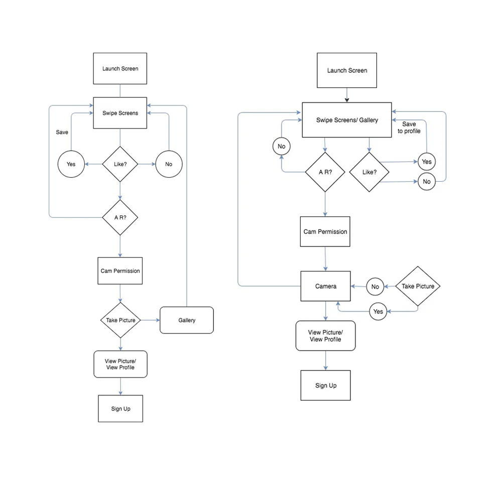
With the user testing results, I moved on to user flows to map out the customer journey. For the scope of this project, I did user flows for on-boarding and purchasing a piece of art.
PURCHASE FLOW and ONBOARDING FLOW
The intension of the interface is clean, futuristic and friendly. With a neon colour palette, white space and a painterly background made it feel futuristic but artistic. With animation, I intended to give the user a sense of friendliness and ease. The visual hierarchy made it easy for the user to access key information i.e. Artist Name, dimensions, and year the art was made.
MOODBOARD
Futuristic. Soft. Fun. With these words in mind, I laid down the foundation for visual design of Soupcan. Using Pinterest, I was able to compile pictures for inspiration quickly and test it with users that fit my Personas.

COLOUR
TYPOGRAPHY
ICONOGRAPHY
LOGO
Soupcan is a tribute to Andy Warhol’s Campbells soup can screen print.
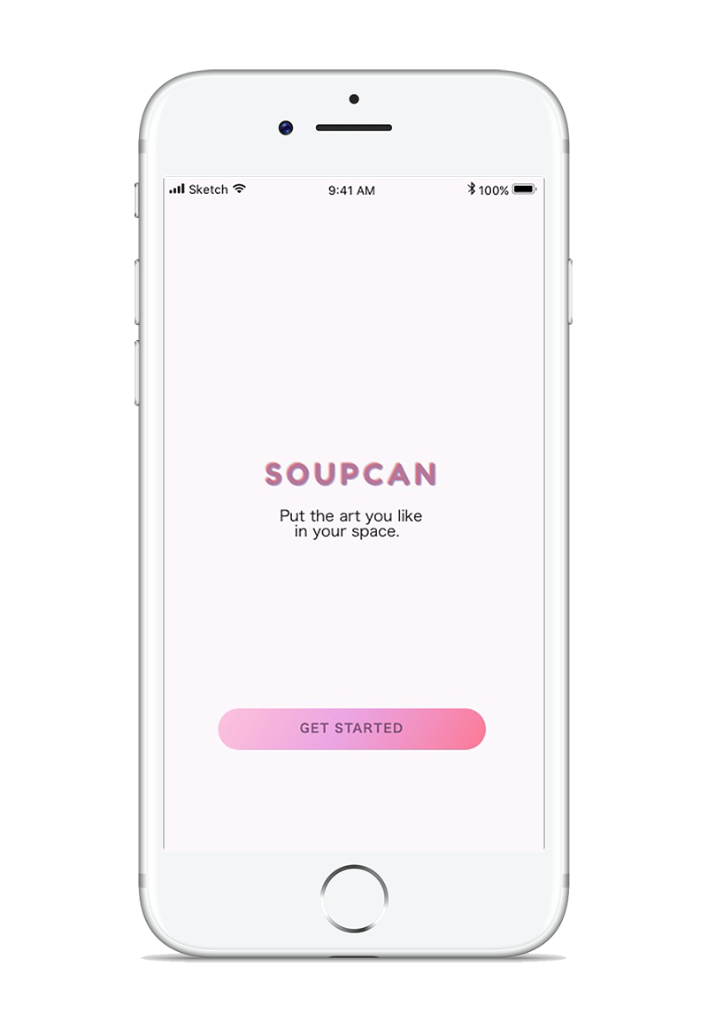
Its a distorted graphic of the word "SOUPCAN" in Fredoka Typeface. The distorting effect illustrates the essence of A R.
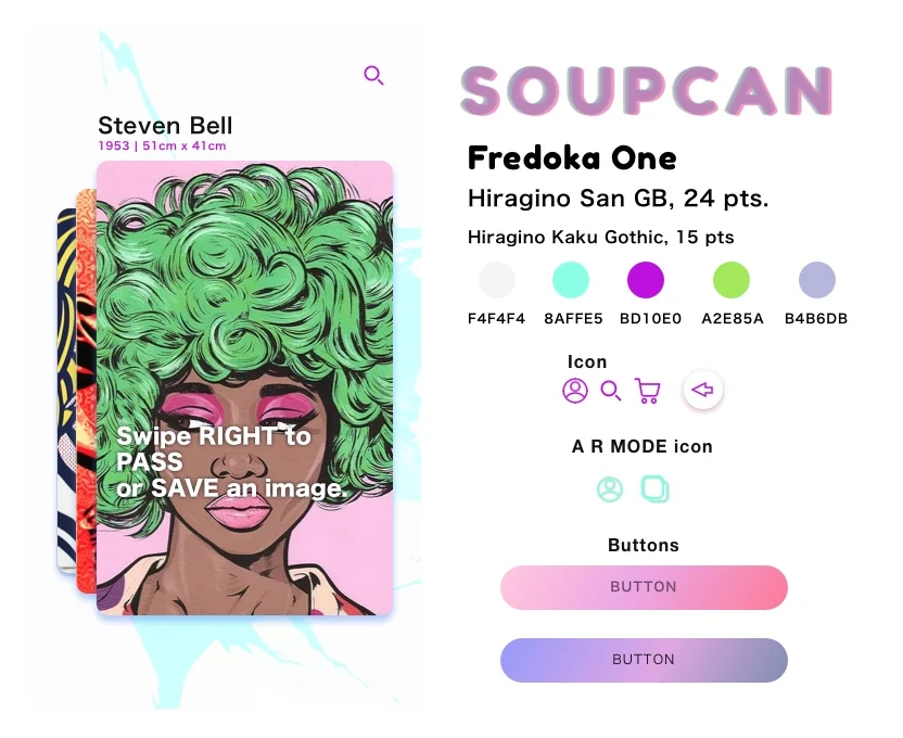

All screens were created in Sketch and photoshop. I drew my original versions of UI elements first on paper, then greyscale - with placeholder content. During every step, I tested each element including placement, colour, content and proportion until all the pieces reached a high fidelity version. .
PROTOTYPING
To preview the application's onboarding process and main features, check out the DEMO VIDEO
1. Don't get attached to your design solutions because it WILL change.
2. Testing at every stage possible (especially lowfi) and iterating quickly allows you to pivot easily with little cost.
3. Let the research guide your design process, for me, user interviews, A/B testing, personas kept me on track.